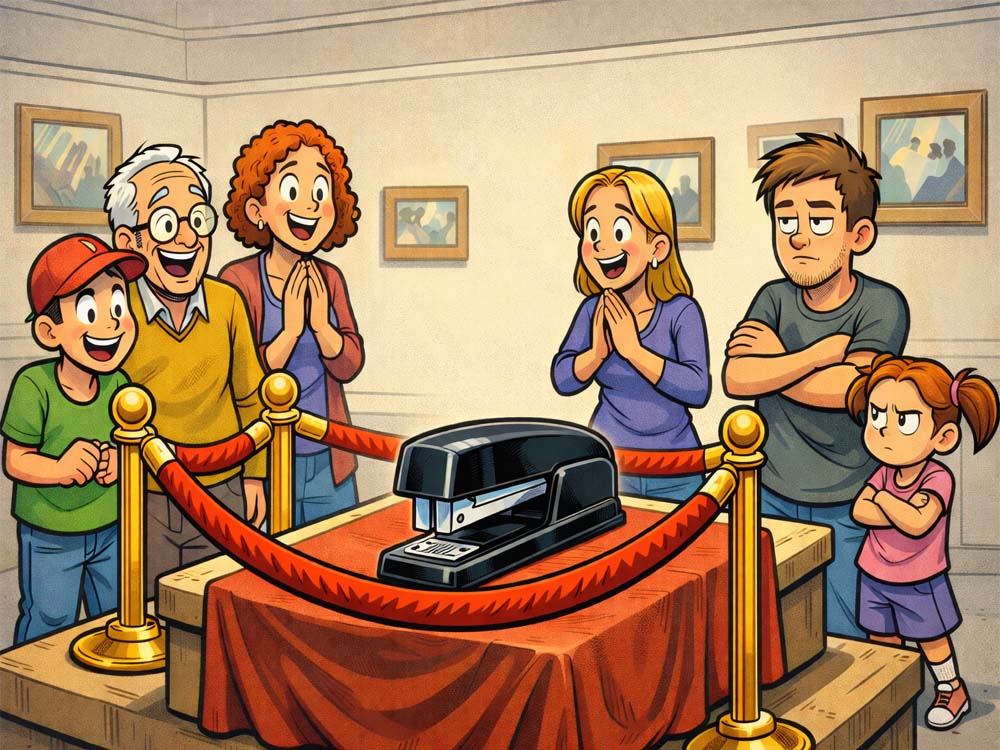
Some museums have dinosaur bones. Others have priceless paintings. And then there’s this institution — boldly roping off a stapler like it once signed the Declaration of Office Supplies.
The beauty of this image is commitment. Not just the velvet rope, but the crowd. Some visitors look genuinely moved, as if this humble desktop hero once fastened the very fabric of society. Others appear less convinced, silently wondering if the tape dispenser is getting its own wing next year.
Comedy thrives on misplaced importance, and this picture practically gift-wraps that idea — then staples it for good measure.
Let’s review what held this contest together.
What We Saw a Lot
Predictably (and appropriately), the field leaned heavily into stapler wordplay. Variations on “staple,” “bind,” “attach,” and “fasten” showed up again and again. When the object itself is this literal, pun gravity is hard to escape.
We also saw a strong “museum plaque” instinct — captions written like historical descriptions or curator commentary. That framing fits the image naturally because the joke already lives in the contrast between everyday object and institutional reverence.
Another recurring approach was office nostalgia: fax machines, TPS reports, pre-digital workflows. This works because it adds cultural context while keeping the stapler grounded in its natural habitat.
The key differentiator across submissions wasn’t the idea category — it was precision. The best captions felt like they belonged on the little card next to the exhibit.
Missed Opportunities
Several captions correctly identified the core joke — ordinary object treated as extraordinary — but stopped one beat early.
For example, museum humor often benefits from specificity. A year, a fake historical era, an absurd academic theory, or curator jargon can elevate a good premise into something that feels fully realized.
Another gap was escalation. Once you decide the stapler is historically important, how important is it? Civilization-saving? Economically transformative? Responsible for the merger of two accounting firms? Turning the dial further often creates the laugh.
We also didn’t see quite as many reactions from the crowd as this image invites. Awe, confusion, reverence, scholarly debate — the onlookers are comedic supporting actors waiting to be cast.
When an image includes multiple emotional perspectives, that’s an opportunity for contrast.
Head to Head
Finalist:
“Best known for its binding influence on the administrative class”
Non-finalist:
“This is the staple that binds us”
Both captions build around the same structural idea: binding as metaphor.
The finalist works better because it commits to the museum voice. “Administrative class” sounds academic, slightly pretentious, and exactly like something you’d read on a plaque. It expands the joke beyond the object into a faux sociological observation.
The non-finalist stays closer to a familiar phrase. It’s clear and pleasant, but it doesn’t surprise us. We’ve heard variations of this construction before.
Lesson: when two captions share the same core pun, the one that creates a richer world usually wins.
Red Lines
“Got it at Staples”
This is a clean observational joke, but it stops at recognition. Readers see the brand connection immediately, so the caption doesn’t add a second layer.
Takeaway: If the audience can finish the joke the moment they read it, consider pushing one step further. Maybe it’s the “last surviving location,” or “now classified as a historic site.”
“Estimated to have bound reports as early as Q3”
This is a strong comedic direction — corporate language applied to archaeology — but it could go sharper. “Q3” is funny, yet slightly generic.
Takeaway: When parodying business jargon, specificity heightens the absurdity. A fake initiative name or over-serious project title might have turned this into a finalist-tier caption.
“I’ll staple u to the wall Hun no more going out for u. Your all mine!!! Partying days r over!!!”
The premise drifts away from the museum setting and into a different comedic universe. Threat-based humor can work, but here it disconnects from the visual logic.
Takeaway: Stay anchored to the image. Even wild jokes land better when they clearly grow out of what viewers are seeing.
“Scholars believe it once held together a very important TPS report.”
Nice cultural reference, but it leans heavily on recognition rather than invention.
Takeaway: References are strongest when they’re a launchpad, not the whole joke. Consider adding a twist — perhaps the report that “nearly brought down middle management.”
Winning Captions & Why They Worked
Winner:
“Fasten-ating!”
Sometimes efficiency is the entire strategy.
This caption succeeds because it’s crisp, unmistakable, and perfectly matched to the object. No extra scaffolding, no explanation — just a tight pun delivered with confidence. The exclamation point even mirrors the wide-eyed awe of the crowd.
In a contest full of longer museum-style captions, brevity became the surprise.
Finalists:
“This is so much better than the invisible tape display.”
Excellent misdirection. It expands the museum universe while implying a deeply disappointing neighboring exhibit. The humor arrives through comparison — a reliable comedic engine.
“OK let’s hurry up and SWING that LINE to the left”
Strong brand reference paired with behavioral specificity. You can practically hear the impatient tour guide.
“Common Bostitch, circa 1994. Artifact from the Late Fax Era.”
Outstanding world-building. Naming the era is what elevates it — suddenly office equipment has archaeological timelines.
“It exhibits attachment issues”
A clean double meaning that feels natural rather than forced. Psychological language applied to office hardware is inherently amusing.
“Best known for its binding influence on the administrative class”
Smart, layered, and fully committed to the academic tone. It rewards the reader without demanding extra effort.
Across these finalists, notice the pattern: clarity first, twist second, restraint always.
Final Thoughts
This contest proved an important comedic principle: there is no object too small to deserve big laughs — especially when surrounded by velvet rope.
When humor treats the mundane like the monumental, readers instinctively lean in. The trick is deciding whether your caption belongs on the plaque, in the tour guide’s script, or whispered reverently by a fictional historian.
Keep studying the exhibits around you. Comedy is everywhere — even on the corner of someone’s desk, quietly holding things together.
Now step past the rope and enter the next contest — we promise the laughs are fully secured.