Caption Contest 125: Recap & Review
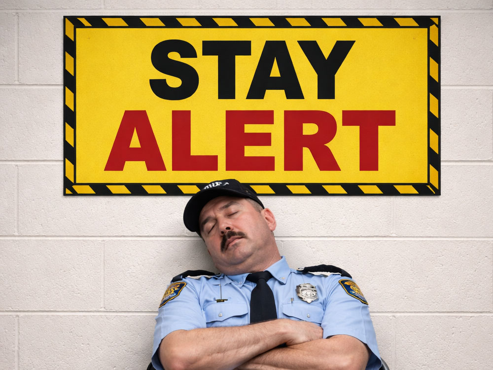
There are few things more dangerous than a security guard who has fully committed to not being alert. This image doesn’t just flirt with irony—it clocks in, clocks out, and takes a nap under it.
A uniformed guard, fully horizontal, posted directly beneath a sign that reads “Stay Alert.” It’s not subtle. It’s not nuanced. It’s a neon-lit contradiction doing stand-up.
And that’s what made this contest fun: the joke is obvious… but the angle is not. Do you go literal? Philosophical? Pun-heavy? Authority-deflating? The best captions didn’t just notice the irony—they used it.
Let’s wake this thing up.
What We Saw a Lot
Unsurprisingly, most captions locked onto the central irony: a guard sleeping under a “Stay Alert” sign. That produced a few predictable lanes:
- Literal contradiction jokes (“Do as I say, not as I do.”, “All the signs were there…”)
- Sleep-as-duty reframes (“I’m just recharging my watch”, “Night watch, day nap”)
- Wordplay on “alert” (notably “REMember to stay alert” and “This man needs more lert!”)
- Denial/justification humor (“Just resting my eyes!”, “I’m on the night shift ‘do not disturb’”)
There was also a noticeable attempt to elevate the joke into something more philosophical or abstract (“Life is 90% about showing up…”), which is a harder needle to thread with such a visually specific setup.
Overall, strong instincts. Most people saw the joke. The difference came down to how cleanly and efficiently they delivered it.
Missed Opportunities
A few captions circled strong ideas but didn’t fully capitalize on them.
The biggest gap: point of view. This image invites you to choose a speaker—management, the guard himself, the sign, even a passerby. Many captions stayed observational instead of committing to a voice.
For example, several entries described the situation instead of framing it. “Caught in the act of inaction” is clever, but it feels like a headline, not a moment. There’s no character behind it.
Another missed opportunity was specificity. The setting is doing a lot of heavy lifting here—uniform, chair, sign placement—but some captions defaulted to generic sleep jokes. The more a caption leaned into this exact scenario, the stronger it tended to be.
Finally, some captions introduced an extra idea (dreams, training, classes) but didn’t connect it tightly enough to the core visual. When you only have one panel, the connection has to snap into place instantly.
Head to Head
Let’s compare:
Finalist:
“The sign is for you, not me.”
Non-finalist:
“I’m on the night shift ‘do not disturb’”
Both captions attempt to justify the guard’s behavior, but one is doing significantly more work.
“The sign is for you, not me.” is clean, immediate, and flips the authority dynamic. It reframes the sign from instruction to misdirection, giving the guard a subtle, almost smug intelligence. It also directly engages with the most important object in the image: the sign.
By contrast, “I’m on the night shift ‘do not disturb’” introduces a new idea (shift logic) that isn’t visually supported. It asks the reader to do extra interpretation without delivering a sharper payoff. The joke is understandable, but it diffuses the core tension instead of sharpening it.
In short: the finalist leans into the image. The non-finalist steps slightly away from it.
Red Lines
“I’m capturing all the bad guys in my dreams”
There’s a solid comedic instinct here—turning failure into justification—but it introduces a second world (dreams) that competes with the visual instead of enhancing it. In single-panel humor, abstraction works best when it tightens the joke, not when it creates a parallel one.
“What an Oxy-Moron!”
This identifies the irony correctly, but stops there. Labeling the joke is not the same as delivering it. The audience already sees the contradiction—the caption’s job is to reinterpret it, not name it.
“Testing the structural integrity of the sign… seems solid”
This is a more creative angle, but the connection feels slightly forced. The humor depends on a leap (that sleeping somehow tests the sign), and that leap doesn’t land cleanly enough to justify the added complexity.
“The back row in the ‘Effective Communications’ class”
There’s a good instinct here—placing the guard in a different context—but the image doesn’t support it strongly enough. Without a clear visual anchor to a classroom, the joke becomes conceptual rather than immediate.
Winning Captions & Why They Worked
Finalists:
“REMember to stay alert”
A sharp pun that actually fits the image. It uses sleep terminology (REM) to reinforce the joke rather than distract from it. Clean, clever, and relevant.
“Caught in the act of inaction”
This leans more literary, but the phrasing is tight and satisfying. It reframes the moment as something official and reportable, which adds a layer of mock seriousness.
“I’m just recharging my watch”
A strong reinterpretation. It turns inactivity into duty with a simple twist. The phrasing is natural and grounded in the guard’s role.
“Life is 90% about showing up, the rest… is just that.”
This one stands out for tone. It’s more philosophical, but the ellipsis lands the joke by implying the rest is… nothing. It works because it commits fully to the voice.
“All the signs were there…”
Short, familiar phrasing applied in a literal way. It’s a phrase we know, but here it becomes visually true. That alignment gives it punch.
Final Thoughts
This was a strong field for a deceptively simple image. The premise did a lot of the work—but the best captions didn’t rely on that. They chose a perspective, stayed tight, and let the irony do the heavy lifting without over-explaining it.
If there’s one takeaway: when the joke is already visible, your job isn’t to point at it—it’s to tilt it just enough to make it feel new.
Now go stay alert… or at least caption like you are. 😴
Check out the next contest and take your best shot.