Tips for Caption Contest 150
Somewhere, a janitor is wildly overqualified for this assignment.
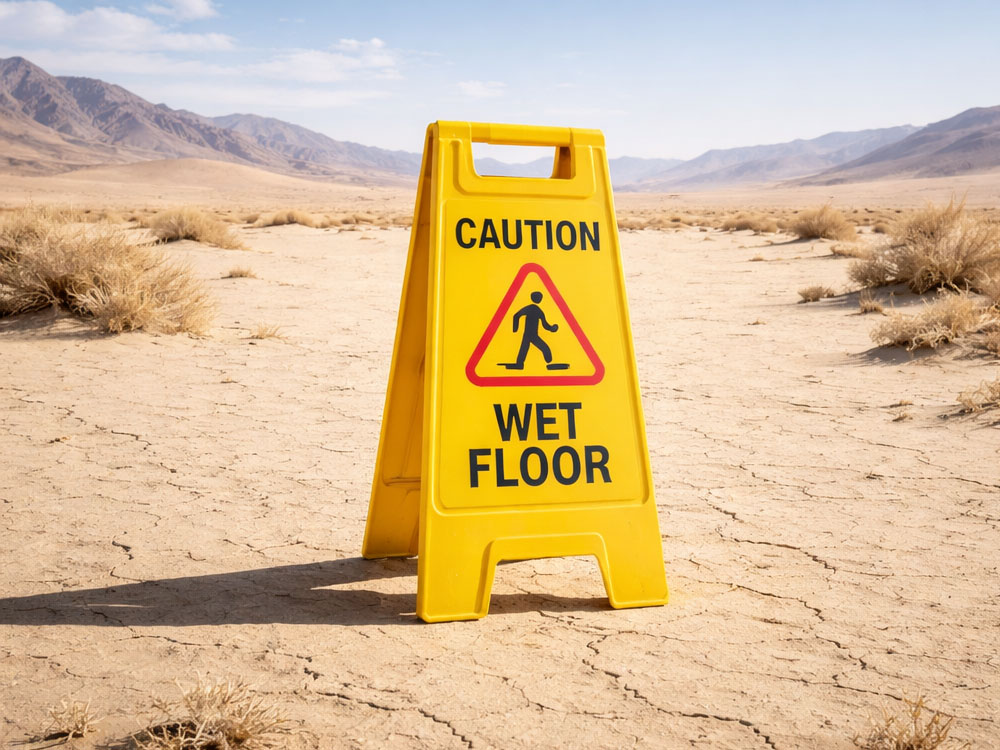
A bright yellow “Wet Floor” sign stands guard over… nothing. No puddle, no spill, not even a suspicious damp patch. Just miles of dry, cracked desert stretching into the horizon.
It’s the kind of warning that feels less like safety protocol and more like a cry for help. Or maybe optimism. Extreme, irrational optimism.
Because if you’ve ever looked at a desert and thought, “Careful, could be slippery,” this image is here to validate you. 🏜️
Getting Started: What’s in the Image?
Let’s inventory what we actually have:
- A standard, recognizable “Wet Floor” caution sign
- A vast, bone-dry desert environment
- No visible water, moisture, or reason for the sign’s existence
- A strong contrast between expectation (wet surface) and reality (extreme dryness)
The sign itself is important—it’s mundane, familiar, and usually context-specific (grocery stores, office lobbies, recently mopped floors). Dropping it into the least appropriate setting possible is where the humor starts.
Also note the scale: the desert feels endless, which makes the sign feel even more absurdly small and pointless. That imbalance is usable.
Think Beneath the Surface
This image works because it’s built on contradiction. The sign promises one thing; reality delivers the opposite.
So where can you go from there?
First, think misplacement humor. This is a classic “wrong tool, wrong place” scenario. The sign is doing its job perfectly—just in a universe where that job makes no sense.
Second, consider over-preparedness. Someone anticipated a problem so unlikely that it loops back into funny. What kind of organization installs wet floor signs in deserts? What liability nightmare are they planning for?
Third, explore false authority. The sign is authoritative—it tells you what to do. But here, it’s clearly wrong. That gap between confidence and reality is rich territory.
Fourth, lean into environmental extremes. Deserts represent dryness, scarcity, heat. “Wet floor” represents the opposite. The humor often comes from pushing those extremes even further apart.
Example (single-line): “Corporate said cover all scenarios.”
You can also go philosophical. The image has a slightly existential quality—warnings with no meaning, systems applied blindly, rules detached from reality.
Or go literal and absurd: what if the sign is technically correct, just not in any visible way?
General Tips on How to Be Funny
1. Start with the obvious mismatch—then add a twist.
Yes, the sign doesn’t belong. That’s step one. Step two is saying something new about it. Don’t stop at “this is wrong”—explain why in a surprising way.
2. Choose a clear comedic angle.
Is your joke about corporate bureaucracy? Over-cautious safety culture? Climate irony? Pick one lane and commit. Scattered ideas weaken the punch.
3. Use specificity to elevate the joke.
Vague captions feel interchangeable. Specific ones feel intentional. Instead of general confusion, imply a precise situation or backstory.
Example (single-line): “Quarterly desert mopping complete.”
4. Let the image do some of the work.
You don’t need to describe the desert or the sign. The viewer already sees that. Use your caption to reframe the image, not narrate it.
5. Keep it tight.
This is a high-concept visual. Long captions dilute the impact. The cleaner the sentence, the sharper the contrast lands.
6. Surprise matters more than clever wording.
A simple, unexpected idea will beat a complicated pun every time. Aim for the moment where the reader goes, “Oh—that’s good.”
7. Test for swapability.
If your caption could work on ten other images, it’s probably too generic. This image is very specific—your joke should be too.
Final Thought
This image is a reminder that comedy often lives in the gap between what should be true and what clearly isn’t—your job is to make that gap feel intentional, not accidental.
Enter your caption now and see if you can turn the driest place on Earth into something unexpectedly slippery.